How to Use Microsoft Excel Quick Analysis to Visualize Data

Microsoft Excel Quick Analysis provides easy-to-find visualization tools to make your content clearer and easier to explain.
With the Microsoft Excel Quick Analysis tool, you can visualize data in many different ways to find the one that works in your situation.
Can you imagine a world without Microsoft Excel? The software title is the world’s spreadsheet powerhouse helping employees, students, and other computer users quickly make calculations, cell by cell. Seeing countless numbers in rows and columns isn’t very sexy, and it’s why many turn to charts to explain those numbers better.
Which chart should you use? A lot depends on how you want to highlight the spreadsheet data.
Microsoft Excel Quick Analysis
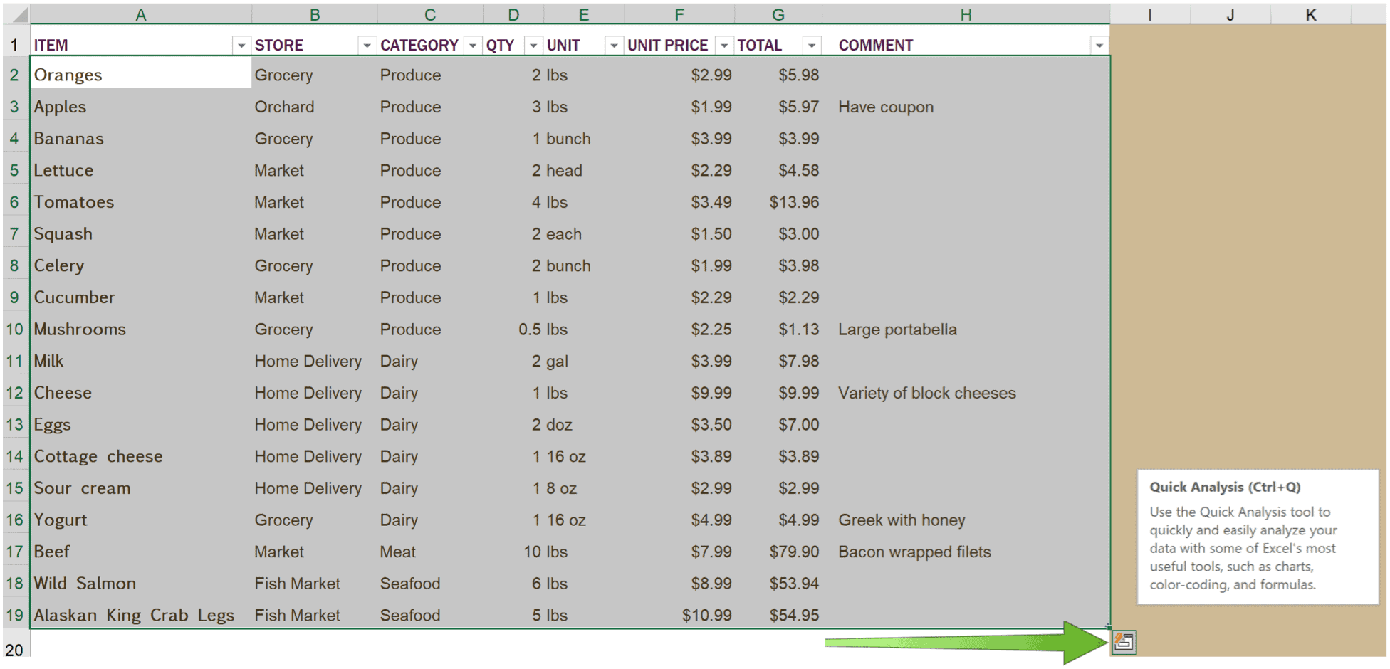
The built-in Quick Analysis tool takes a range of data in Excel and helps you pick the perfect chart with just a few commands. Doing so is fun, easy, and takes just a few seconds. In the following example, you’ll see a spreadsheet showing a list of food items that need to be purchased for a household. Besides the names of each item, the spreadsheet shows its store location, category, quantity need, price, and total cost.

The information in this chart is easy to understand and thorough. However, it’s not necessarily exciting. That’s about to change with the Microsoft Excel Quick Analysis. To get started, we’re going to group the relevant cells in the chart. At the bottom right of the selected cells, click on the Quick Analysis icon.
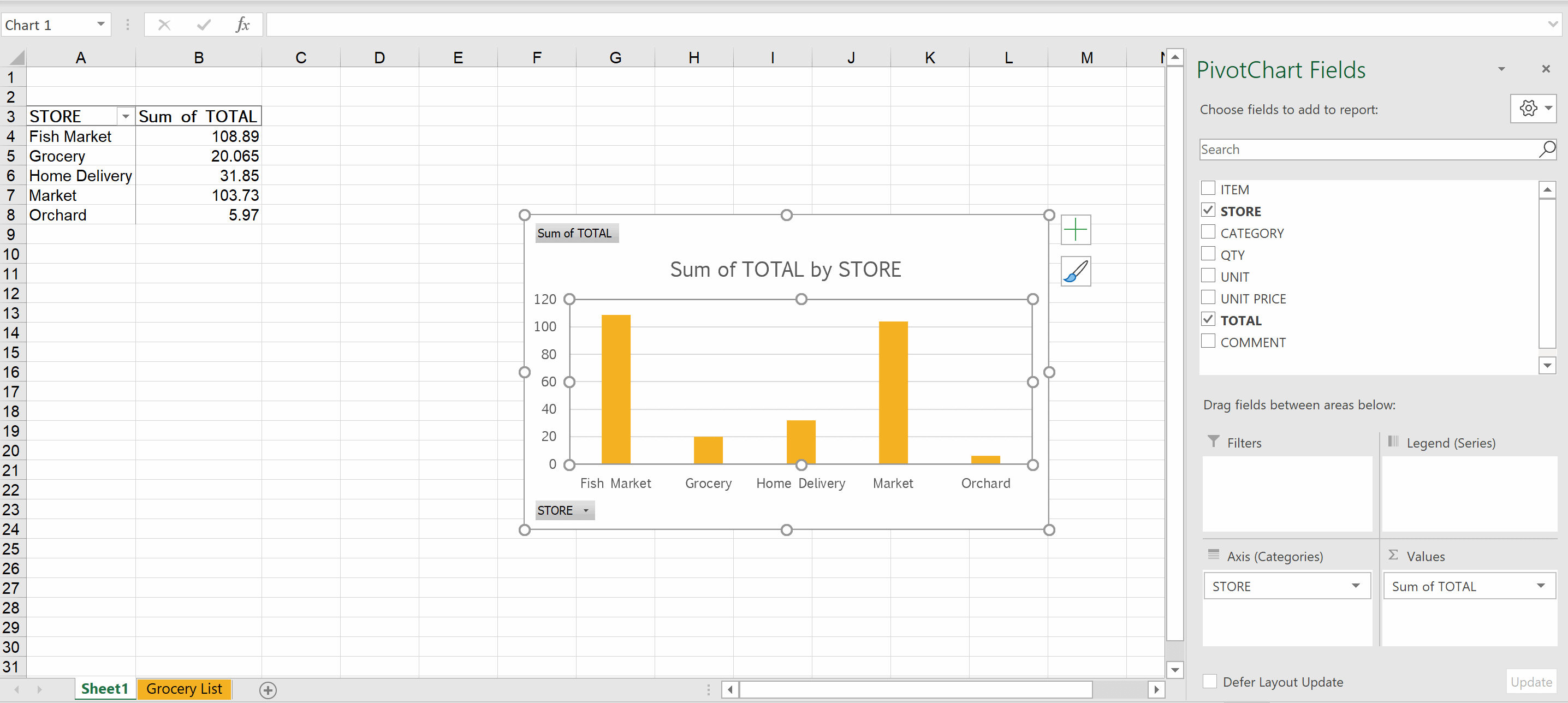
Once you do, you’ll find different tabs, including one for charting. The charts listed are recommended based on the type of information you’ve highlighted above. In our example, you can click on the Charts options and find layouts that include the sum of quality by store, the sum of the total by store, and more. When you find a chart you like, click on it.
From there, you’ll see the chart you just selected, along with a summary of how the chart was compiled. The information is on a separate page in your spreadsheet, and better still will adjust as numbers on the original spreadsheet change.

Excel Quick Analysis Options
The five tabs in the Quick Analysis pop-up box include Format, Charts, Totals, Tables, and Sparklines. Review each tab, then click on each option to see which is the best way to show off the numbers for your audience. However, not every tab will necessarily offer a viable option since each depends on the type of content in your spreadsheet.

Formatting
Microsoft Excel’s Conditional Formatting options let you visualize the data in your spreadsheets. In doing so, you can better understand what you’re trying to represent with the data at a single glance. The Formatting section under Quick Analysis gives you more immediate access to many of those tools and allows you to bypass the Excel Ribbon.
Charts
Microsoft made the Quick Analysis tool to provide easier access to Excel’s charting options. Hover over a sample chart, then click on the one you want.
Totals
Under Totals, you’ll find solutions that calculate numbers in columns and rows, including Sum, Average, and Count.
Tables and Sparklines
Both Table and PivotTable options are available here, as are Sparklines. The latter are tiny charts you can show alongside your data in single cells. They’re great to show off data trends.
With Microsoft Excel Quick Analysis, you can visualize data in different ways to bring more depth to the numbers. It’s not the only Excel tool we’ve covered recently. We also covered how to lock certain cells, rows, or columns in the spreadsheet app and highlight duplicates.


