How to Make a Box Plot in Excel

If you’re presenting or analyzing difficult statistical data, you might need to know how to make a box plot in Excel. Here’s what you’ll need to do.
Microsoft Excel allows you to create informative and attractive charts and graphs to help present or analyze your data. You can easily create bar and pie charts from your data, but creating a box plot in Excel has always been more challenging for users to master.
The software didn’t provide a template specifically for creating box plots, but it’s much easier now. If you want to make a box plot in Excel, here’s what you’ll need to know (and do).
What Is a Box Plot?
For descriptive statistics, a box plot is one of the best ways to demonstrate how data is distributed. It shows the numbers in quartiles, highlighting the mean value as well as the outliers. Statistical analysis uses box plot charts for everything from comparing medical trial results to contrasting different teachers’ test scores.
The basis for a box plot is to display data based on a five-number summary. This means showing:
- Minimum value: the lowest data point in the data set, excluding any outliers.
- Maximum value: the highest data point in the data set, excluding outliers.
- Median: the middle value in the data set
- First, or Lower, quartile: this is the median of the lower half of the values in the data set.
- Third, or Upper, quartile: the median of the upper half of the data set’s values
Sometimes, a box plot chart will have lines extending vertically up or down, showing how the data might vary outside the upper and lower quartiles. These are called “whiskers,” and the charts themselves are sometimes referred to as box and whisker charts.
How to Make a Box Plot in Excel for Microsoft 365
In past versions of Excel, there wasn’t a chart template specific to box plots. While it was still possible to create it, it took a lot of work. Office 365 does include box plots as an option now, but it’s somewhat buried in the Insert tab.
The instructions and screenshots below assume Excel for Microsoft 365. The steps below have been created using a Mac, but we also provide instructions where the steps are different on Windows.
First, of course, you need your data. Once you’ve finished entering it, you can create and stylize your box plot.
To create a box plot in Excel:
- Select your data in your Excel workbook—either a single or multiple data series.
- On the ribbon bar, click the Insert tab.
- On Windows, click Insert > Insert Statistic Chart > Box and Whisker.
- On macOS, click the Statistical Chart icon, then select Box and Whisker.
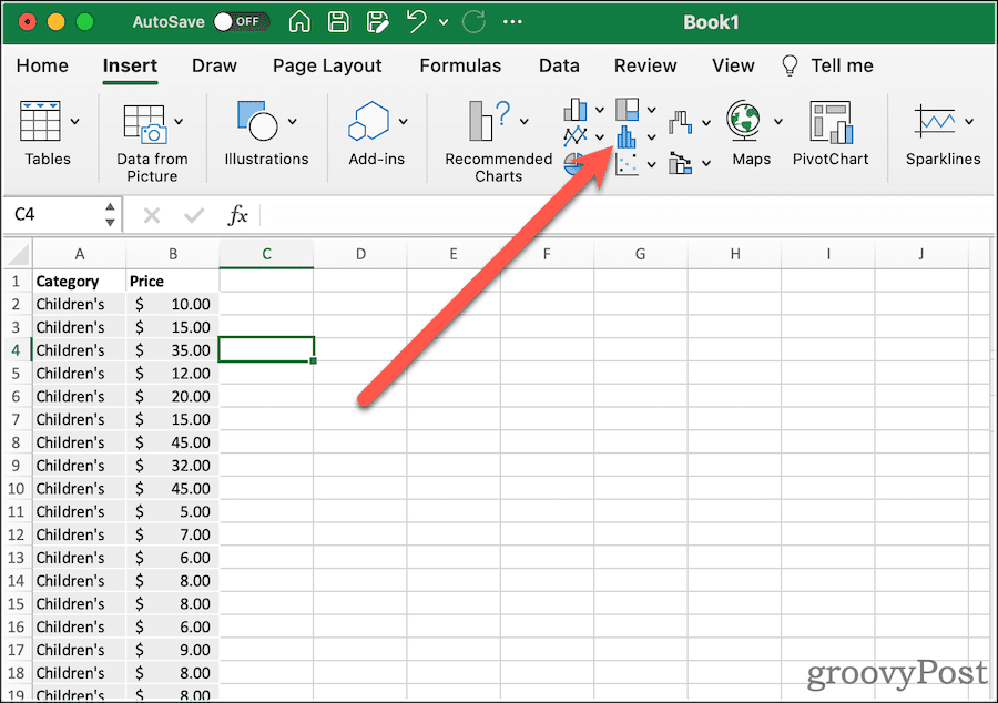
That will net you a very basic box plot, with whiskers. Next, you can modify its options to look how you want.
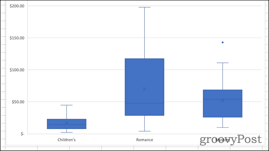
Formatting a Box Chart in Excel
Once you’ve created your box plot, it’s time to pretty it up. The first thing you should do is give the chart a descriptive title. To do this, click the existing title, then you can select the text and change it.
From the Design and Format tabs of the ribbon, you can modify how Excel styles your box chart. This is where you can select the theme styles used, change the fill color of the boxes, apply WordArt styles, and more. These options are universal to just about all of the charts and graphs you might create in Excel.
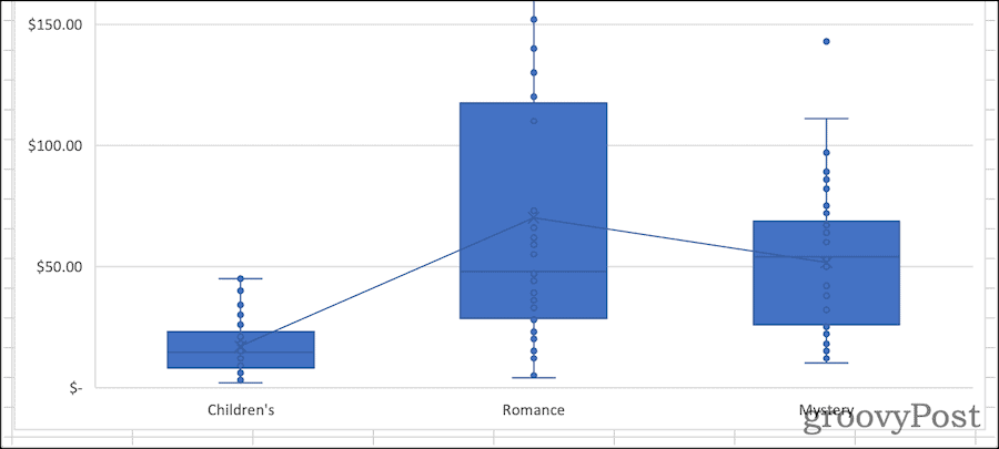
If you want to change options specific to the box and whisper chart, click Format Pane. Here, you can change how the chart represents your data. For example:
- Show inner points: If selected, your box plot will also show individual values within the first and third quartiles. Excel shows this with one dot for each value, not a dot for each record in the data set.

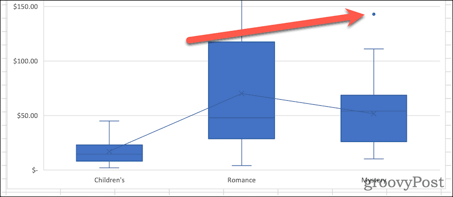
- Show outlier points: When you enable this, your chart will include markers showing data points outside the whiskers. In other words, this would be a data point that is an abnormal distance from other values in the data set.

- Show mean markers: This option turns on or off the mean marker in each box.
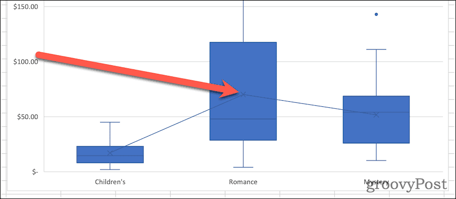
- Show mean line: If checked, a line is drawn connecting the mean values for each of your data sets.
- Quartile Calculation: Your quartiles can be calculated either including or excluding the median when you have an odd number of data points. Generally speaking, an exclusive interquartile range is more appropriate for large samples of data. A smaller sample can benefit from the inclusive median method since it tends to be more representative for a narrower range of data points.
A Welcome Addition for Statistical Analysis
It wasn’t always so easy to figure out how to create a box plot in Excel. Creating the chart in previous versions of the spreadsheet software required manually calculating the different quartiles. You could then create a bar graph to approximate the presentation of a box plot. Microsoft’s addition of this chart type with Office 365 and Microsoft 365 is very welcome.
Of course, there are lots of other Excel tips and tricks you can learn if you’re new to Excel. Box plots might seem advanced, but once you understand the concepts (and the steps), they’re easy to create and analyze using the steps above.


Fateme
June 24, 2023 at 5:43 am
thank you it was useful
Chungus Bungus
August 18, 2023 at 4:09 am
Really helpful! I didn’t realise I needed to have all my data in one column.