How to Add Error Bars in Google Sheets

If you want to quickly show error projections, you can use an error bar. Here’s how to add error bars to a Google Sheets spreadsheet.
If you’re working with projected figures in Google Sheets, it can be helpful to show some margin for error. Using error bars on your charts allows you to indicate the likely range of possible errors rather than sticking with a single figure—a figure which might be wrong.
Inserting error bars in Google Sheets is fairly simple to do and you can customize them to suit your needs. Here’s how to add them to your spreadsheet.
How to Insert a Column Chart in Google Sheets
Before you can add error bars to a chart, you’ll need to add your chart in the first place. Adding a column chart takes just a few clicks.
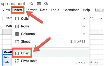
To insert a column chart in Google Sheets:
- Highlight the data you want to turn into a chart. If you include the column headings, these will become the labels for your axes.
- Press Insert > Chart.

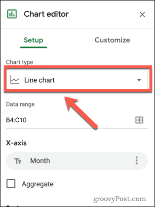
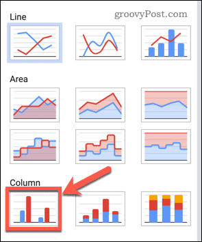
- In the Chart Editor on the right of the screen, open the Chart Type dropdown.

- Select a column chart to create your chart.

How to Add Error Bars in Google Sheets
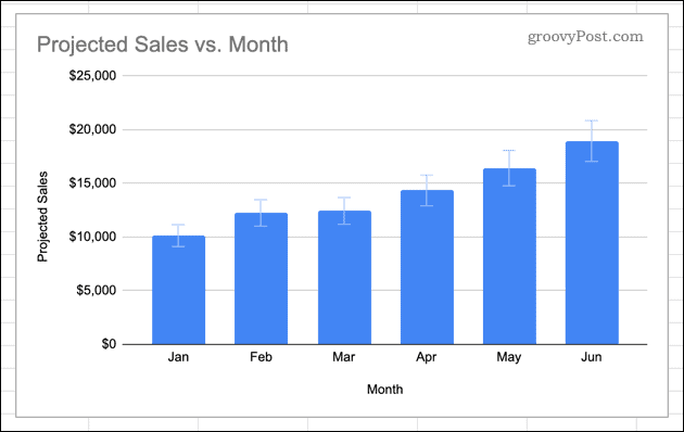
Now that you have your column chart, you can add error bars to it. There are a number of different types of error bars you can choose from in Google Sheets.
To add error bars in Google Sheets:
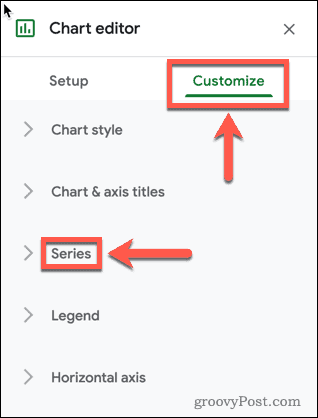
- Double-click your chart to launch the Chart Editor to the right of your screen.
- In the Customize tab, press Series.

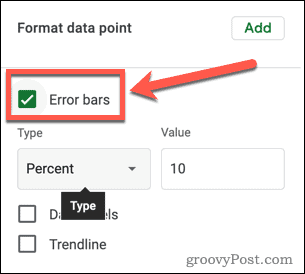
- At the bottom of the Series options, make sure that the Error Bars option is enabled.

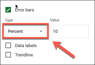
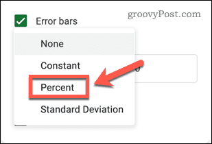
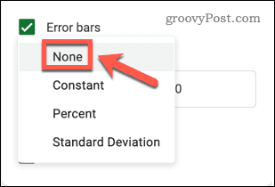
- Next, open the Type dropdown.

- Choose Constant if you want the error bars to be a set value above and below each column. For example, for a column with a height of 100, a constant error bar with a value of 10 would show the range from 90-110.

- Choose Percent if you want the error bars to be at a set percentage above and below each column. For example, if you set your error bars to 10 percent, they would show from 90 to 100% of each column’s value.
- Choose Standard Deviation if you want the error bars to show the standard deviation for your data. These will appear in the same position for each column.
- Choose None if you want to remove error bars from your chart.
- Set the value that you want your error bars to show.

- Once you’ve made your choice, your error bars will display on your chart. You can close the Chart Editor unless you want to make any more edits to your chart.


Using Charts in Google Sheets
Knowing how to add error bars in Google Sheets allows you to show a margin of error in your figures.
Adding error bars is just one way to create and customize charts in Google Sheets. If you don’t want to use an entire chart, you can insert and customize sparklines in Google Sheets to give a simple visual indication of trends in your data.
If you create a chart that you want to share with the world, you can embed a Google Sheet on a website to show it off.


