Show Uncertainty in Your Data By Adding Error Bars in Excel

Data can be variable. If you’re creating a chart, you might want a way to show this variability. If so, here’s how to add error bars in Excel.
Imagine you have a room full of 100 people. You want to find their average heights, but measuring 100 people will take forever, so you pick the 10 shortest people and measure their heights.
In many circumstances, this method isn’t going to be very accurate. The average of the ten shortest people will be shorter than the average of all 100. However, if the people in the room are all around the same height, the average of the sample of the ten shortest people will be reasonably close to the “true” average.
If only there were some way to determine how accurate your sample is likely to be. Well, there is. In fact, there are a lot of ways of calculating how far your result is likely to be from the “true” value.
If you’re creating charts in Excel, you can add error bars to your charts that will display how likely it is that your value is close to the “true” value. These error bars can give you a quick visual indication of how accurate the values on your chart are likely to be. Here’s how to add error bars in Excel.
How to Add Standard Error Bars in Excel
There are several types of error bars available to choose from in Excel. One option is to create error bars that display the standard error, a statistical measure that compares a sample of data to the entire population. It allows you to gauge how accurately a sample distribution represents the entire population.
If error bars showing the standard error have a wide range, this indicates a large amount of variability in your data. If they are small, your sample is more likely to be representative of the population as a whole. Excel can automatically calculate the standard error and add these error bars to your charts.
- Click anywhere on your chart.
- Click the + (plus) icon that appears in the top-right corner of your chart.


- Hover over Error Bars and click the Arrow that appears.

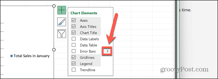
- Select Standard Error.


- You should now see Error bars displaying the standard error on your chart.

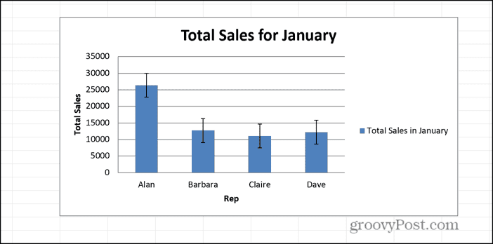
How to Express Potential for Error in Percentage
Another type of error bar available in Excel is percentage error bars. These bars show a fixed percentage error for each value, with the default value being 5%. However, you can change this percentage in the options if you wish.
- Click somewhere in your chart.
- Click the +(plus) icon in the top-right of your chart.


- Hover over Error Bars and click the Arrow.


- To add error bars with the default 5% value, click Percentage.


- You should now see 5% error bars on your chart.

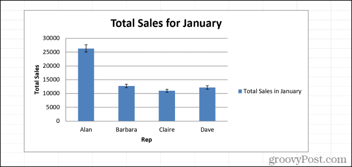
- To use your own custom value, click More Options instead of Percentage.


- Under Error Amount, select Percentage and enter the percentage value you want to use.


- Press Enter and your error bars will appear on your chart.

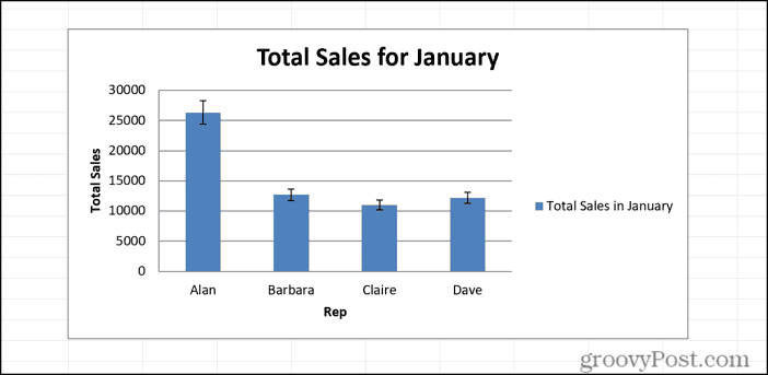
How to Add Standard Deviation Bars
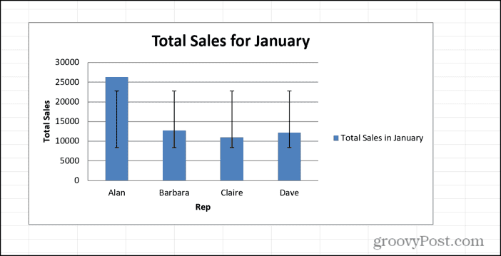
Standard deviation is a statistical measure that represents how spread out a set of data is, and has a wide range of uses in statistics, such as standardizing test scores, for example. If the standard deviation is low, for example, then the data is all quite tightly bunched. If the standard deviation is high, then the data is much more spread out. It is calculated by finding the square root of the variance, with the variance being the average of the square of each data point’s distance from the mean.
You can add standard deviation error bars to your charts in Excel. If the error bars are close together, then your data is fairly tightly bunched, but if the error bars are wide apart, then your data is much more spread out. Since the standard deviation is measured across all your data, these bars will appear the same each they appear.
- Click on your chart.
- Click the + (plus) icon.


- Hover over Error Bars and click the Arrow that appears next to it.


- Select Standard Deviation.


- You should now see standard deviation error bars on your chart.

How to Add Fixed Value Error Bars
As you might expect, fixed value error bars in Excel display a fixed error amount for each data point in your Excel chart. If you know the error range of your data, you can use this option to enter the exact value that you wish.
- Click on your chart and then click the + (plus) icon in the top right.


- Hover over Error Bars and click the Arrow that appears.


- Select More Options.


- Under Error Amount, select Fixed Value and enter the fixed value that you want to use.


- Press Enter and your fixed value error bars are added to your chart.


How to Add Custom Error Bars
If none of the options above give you the exact type of error bars that you want, you can create your own custom error bars instead. These allow you to set both the positive and negative error values for your error bars. You can do so by entering set values, or you can link to cells in your spreadsheet, so that the error values can be dynamic, and will change as your data changes.
- Click on your chart and then click the + (plus) icon.


- Hover over Error Bars and click the Arrow.


- Select More Options.


- Under Error Amount, select Custom.


- Click the Specify Value button.


- Enter a value for your Positive Error Value or click in a cell to use the value from that cell.


- Repeat for your Negative Error Value.


- Click OK and your error bars will appear on your chart.

What Are Error Bars in Excel?
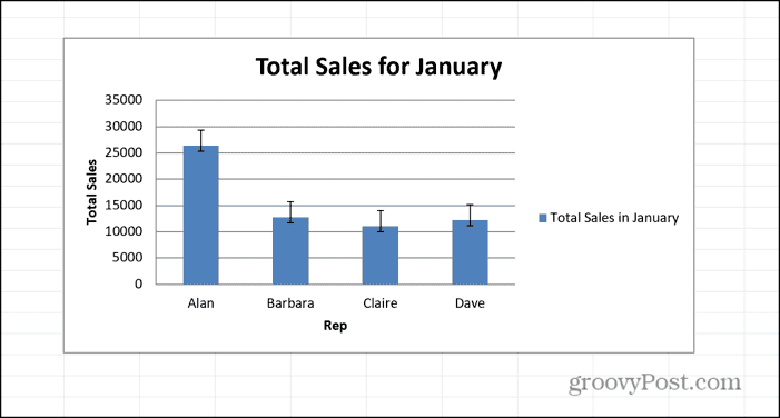
Error bars in Excel are a way of providing a visual indication of how accurate a value is likely to be. If a value has small error bars, then it is likely to be close to the correct value with little chance of error. If the value has large error bars, then there is a lot of variability in the Excel data, and the value on the chart could potentially be fairly far from the “true” value.
These error bars allow you see at a glance how variable your data is and how likely it is that the values on your chart are close to the “true” values.
When Would You These Labels?
Error bars are a good visual indication of how spread out your data is. Error bars showing the standard deviation, for example, give you an instant overview of whether your data is all quite close together, or whether there is a large spread of values.
If you already have measure of the error for your data, you can add error bars using these values to your charts, to easily show the range of values that your data will fall between. This is useful for making comparisons; one bar in a bar chart may be higher than another, for example. If the error bar for the smaller chart reaches higher than the main bar for the larger one, however, then you cannot say for certain that one set of data is larger than the other, once you’ve taken the potential errors into account.
Making Your Charts More Detailed by Expressing Variability
Learning how to add error bars in Excel is a useful way to add helpful information to your charts that avoids them being misinterpreted and allows you to quickly see an indication of the variability of your data. Excel makes it easy to add these error bars in just a few clicks. Error bars aren’t suitable for all situations, however, so if you’re new to the concept, it’s worth reading up so that you have an understanding of when and where to use error bars, and which types are most suitable for your data.
Leave a Reply
Leave a Reply


