How to Create a Radar Chart in Excel

Are you looking to create a radar chart in Microsoft Excel? You’ve come to the right place. Here are the simple steps to follow.
In this article, you’ll learn how to create a radar chart in Microsoft Excel. With a radar chart, you can quickly compare the values of three or more variables relative to a central point. There are three types of radar charts in Excel. These include a simple radar chart, radar chart with markers, and radar chart with fills. These types of charts are ideally suited for showing outliers and commonalities between variables on the same scale.
Typically, radar charts compare multiple variables on a two-dimensional plane with all of the axes equally distributed. Here’s how to set the charts and why they are useful.
Create A Radar Chart in Excel
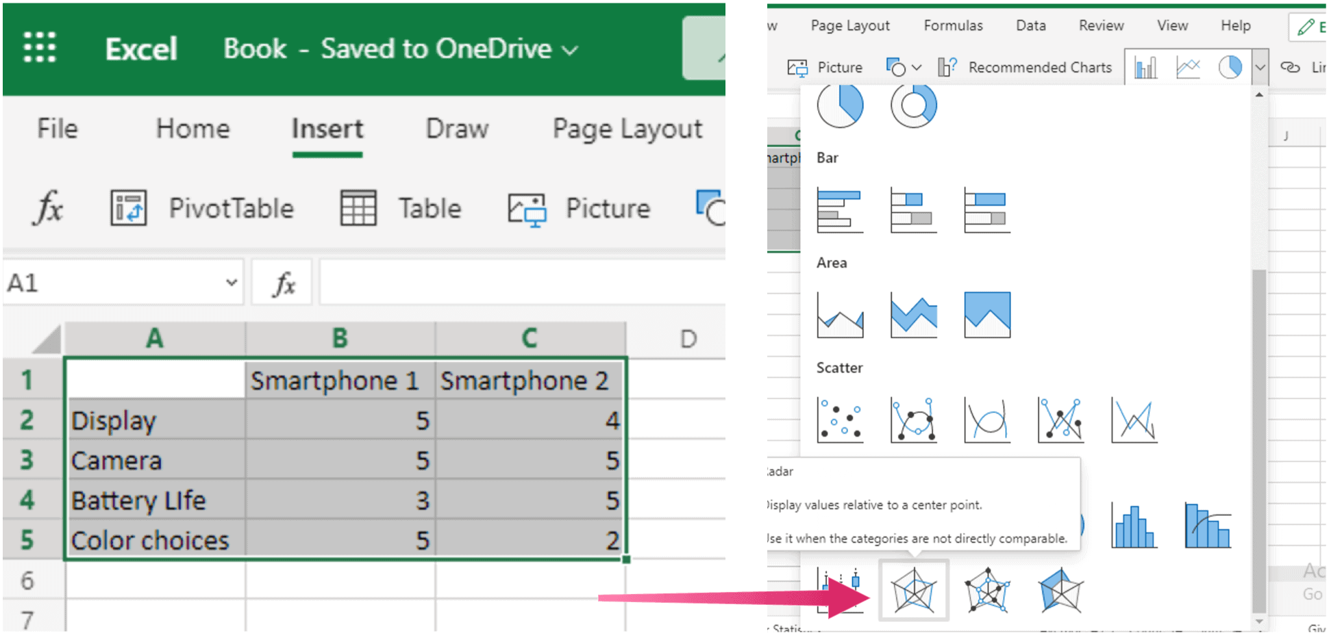
For this exercise, we’re going to complete radar charts using two sets of sample data. The first shows and compares different aspects for two new smartphones, including display, camera, battery life, and color choices. The second looks at two employees and how they differ on key skill sets, such as punctuality, meeting deadlines, kindness, and problem-solving.
To start:
- Open Excel on your computer.
- Next, highlight the rows and columns that contain the data you wish to use on your chart.
- Choose Insert.
- Select the Charts pull-down menu.
- Finally, scroll down to the Others section, choose the type of radar chart you wish to use. The choices are radar, radar with markers, or filled radar.
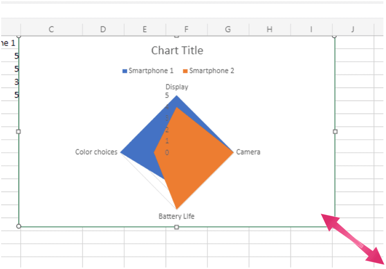
Here’s an example of a regular radar chart using smartphone data:

Here’s another example of a regular radar chart. It compares ratings for two employees.

Here’s a look at the same data from above on a radar chart with markers, and one with filled radar, respectively:

That’s it! Creating radar charts in Microsoft Excel takes just a few steps.
Resize and Move a Chart
As you can with other charts in Excel, you can easily resize or move them. For example, you can drag it in/out from a corner or edge to resize a radar chart. Meanwhile, to move the chart, choose it and use the four-sided arrow to drag it to a new spot in the sheet.
To move a pie chart, select it and use the four-sided arrow to drag it to its new spot on your sheet.
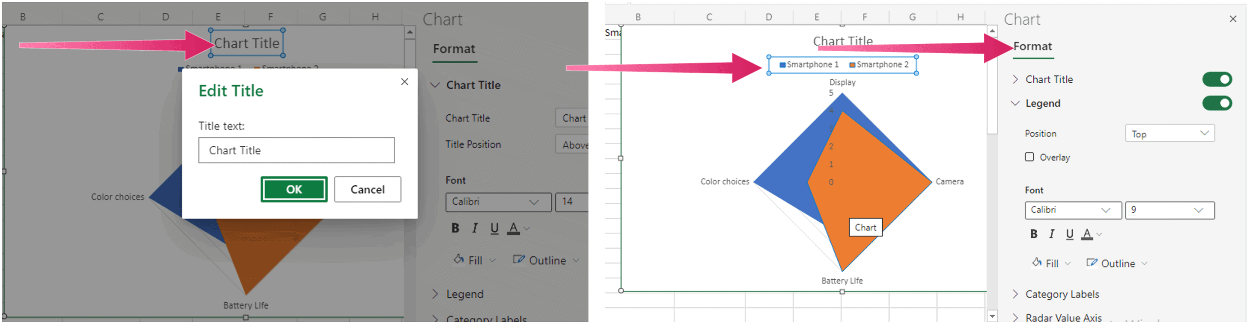
Customize the Radar Chart and Display Your Data
To make your chart even better and unique, you can edit it to include a title, different fonts and sizes, and more. Double-tap on a word on the chart and make your changes to get started. As you can see in the following examples, chart titles and fonts are changed.
For additional chart options in Microsoft Excel, check out our reports on creating a Gantt chart, scatter plot, and pie chart.


